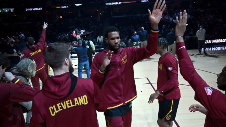
The Cleveland Cavaliers updated their logo earlier in the offseason, but Monday morning they finally revealed their long-awaited new uniforms.
The Cavs have had the current uniforms ever since Nike became the official jersey supplier for the NBA since the 2017-2018 season. The jerseys they’ve been wearing are holdovers from LeBron James’ final season in Cleveland. For a while it felt like the Cavaliers needed a uniform rebrand/update, as the previous ones weren’t very popular and they finally got it.
It started with the Cavs releasing a version of an updated logo earlier in the offseason. The big selling promo for the Cavaliers was “Gold is back.”
Clearly the Cavs wanted to go in a different direction. Again the Cavaliers have needed a uniform update for a while and as an emerging young team that appears to just be scatching the surface they wanted to go with a new look. As of Monday morning the rebrand finally is complete, as the Cavs released their new uniforms.
The new threads ✨#LetEmKnow
— Cleveland Cavaliers (@cavs) July 18, 2022
The new Cavs uniforms have a clean look, and they’re ones the region can appreciate.
I think the Cavs did a great job here. They were able to have a rebrand of the new uniforms with a better modernized look, while not completely going overboard with doing too much. It reminds me a little bit of when the Cleveland Browns rebranded in 2020. The Browns went overboard with it back in 2015, but not long after went with a simpler, more modernized look that fans really liked.
I’d say the ones that stick out to me are the home white Association uniforms. They’re simple, modernized and very well done. I also think the third version of the jerseys, the black Statement ones were designed really well and are an upgrade of the previous ones. I also think the away wine Icon ones are an upgrade from the previous version of the away jersey. On the end of the jersey, they’ve got a gold name plate on the front and back, also having the Cleveland-Cliffs logo in gold. The shorts have the Big C with plenty of gold on the outline as well.
Of the jerseys the Cavaliers had previously, the away uniforms felt as if they needed the biggest uplift. It doesn’t jump out as much as the home association and white, but they’re certainly an upgrade from the previous away uniform version.
When the Cavs marketed the gold is back they really did prioritize gold being on the uniforms. As you can see the white ones probably have the least amount of gold, but it has a red “Cavs” name plate with some gold mixed in, the gold Nike swoosh and on the shorts the Cavs “C” with a good amount of gold on the outline of the C, also having the Cliffs logo in blue.
Each uniform combination is uniquely different and we see that with the statement one as well. The black statements have the big C on the front of the jersey with gold prominent in the outline. You also see the Cliffs logo and Jordan logo in gold. The shorts unlike the previous two have the Cavs on it in gold along with a basketball and net.
Cavaliers Creative Director Daniel Arsham said the following regarding the new uniforms, via the team link above on the Cavs website.
"“It’s a very clean, reductive, modern design that pays homage to all of the players and fans that have been a part our our team’s remarkable journey in becoming who we are today.”"
All in all, I believe these uniforms were a much needed upgrade and a clear improvement from the previous ones from recent seasons. It’s a good change as we go into a new, promising era of Cavaliers basketball with one of the better young cores in the league.
The Cavs wanted to go with a young, exciting new look that complemented a young, ascending team and that’s what they did. I think it’s a look the fans and region will like and appreciate.
