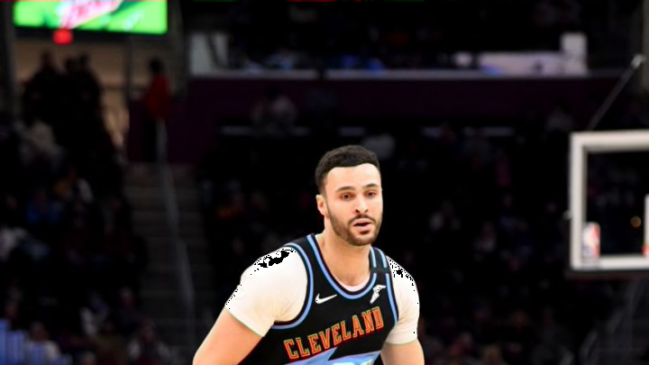
The Cleveland Cavaliers’ latest “City” uniforms were released on Thursday.
On Thursday, the Cleveland Cavaliers released the 2020-21 version of their “City Edition” uniforms, which admittedly, aren’t the most aesthetically pleasing.
Cavs fans don’t seem to be too impressed, and I can understand why, at least as far as the physical look of them.
The jerseys are predominantly black, with wine and gold trim on the perimeter of the uni, albeit I can’t say I’m the biggest fan of the physical look.
But on the plus side, the idea and City court for the Cavs are both creative, and definitely will be the engaging the local fan base from the Land, if you will. It was great to see Collin Sexton, Cleveland’s 2019-20 leading scorer with 20.8 points per game, and Larry Nance Jr., a fan favorite and budding all-around big, donning the uniforms in the team’s City jersey release video, too.
https://twitter.com/cavs/status/1334505169749504002?s=20
The appearance isn’t the best, but again, the Cavs’ idea/court are cool.
The look of the uniforms are hardly the look of last year’s, or from the 2018-19 seasons, which incorporated more of the earlier looks from the 1980’s/90’s prior Cavs teams.
I was personally more of a fan of that blueish/orange and with last season’s, the later 90’s blue/black appearance, albeit the Cavs clearly putting the emphasis on Cleveland’s rock and roll roots will be nice to see play out in games for fans.
For just some more background, here was some on that, regarding the rock influence from the Cavs Team Shop uniform release statement.
"“It is well documented that Cleveland’s place in rock and roll history began in the 1950’s when a new genre of music was introduced to a mainstream audience by Cleveland disc jockey Alan Freed. When Leo Mintz, owner of Record Rendezvous in downtown Cleveland shared with Freed that white teenagers were buying music that was marketed to black America, unbeknown to him, Freed was about to move the needle on the sound for a new generation.On his WJW-AM radio show, Freed started to play the rhythmic and soulful songs that made the kids dance in the aisles at the record store, and with that, he popularized African American music called “rhythm and blues” to a new audience craving the urban vibe.Freed coined it “rock and roll.”Dubbing himself the “Moondog,” Freed organized the Moondog Coronation Ball featuring a lineup of R&B artists that drew an estimated 20,000 fans outside and inside the 11,000 seat Cleveland Arena on March 21, 1952. It was considered the first-ever rock and roll concert. Ultimately, unable to accommodate the spirited large crowd the show was cut short, but it foreshadowed a city that was passionate about its music.”"
When it comes to the lettering of the uniform, aside from the letter “C,” the jersey’s “Cleveland” writing on the front features eight different lettering fonts with influence from differing posters/graphics with the thought process based on how notable artists/album covers have had their varying looks.
The graphic badges on the leg of the jerseys, per the Cavs Team Shop release, “mimic styles found within tour pins, jacket patches, and graphics that followed the evolution of rock and roll.”
That’s a nice element to the look, and the Rock Hall’s anthem, “LONG LIVE ROCK,” on the “jock tag,” as noted by the Cavs Team Shop release, is on-point with the clear influence here in intersecting the musical and sports influence in regards to the city of Cleveland.
Moving along from there, though, in terms of the actual color/aesthetics, though, I’m all-in on the Cavs’ 2020-21 City floor. That is said to be linked to the Record Rendezvous storefront on the perimeter in black, as noted by the Cavaliers. That’s a thumbs up move.
What’s an artist without his or her stage?
— Cleveland Cavaliers (@cavs) December 3, 2020
Our 20-21 City Edition court features solid gray hardwood and a black perimeter design inspired by the iconic Record Rendezvous storefront.#ClevelandAmplified pic.twitter.com/QLt862XzvI
The emboldened “C” at midcourt with that fitting look within this season’s theme for Cleveland is a nice add, but that “solid gray hardwood” floor to me is a much better look overall for the theme than the predominantly black jerseys themselves, frankly.
Albeit the accent to the floor again is the key part of the look, and the patches with that rock and roll feel are a great touch, as is the case with the uniforms.
The floor/jerseys highlight how, as the aforementioned release alluded to how the rock/musical evolution in Cleveland “grew with the emergence of progressive rock station WMMS 100.7 FM,” and how the Agora venue were “both credited for shining the spotlight on little-known artists like Bruce Springsteen, David Bowie, Tom Petty and the Heartbreakers and many others,” which is clear here.
So again, while I’m not necessarily the biggest fan of the actual presentation of these 2020-21 Cavs’ “City Edition” jerseys themselves, the idea behind them/the court involving Cleveland’s rich rock and roll history is definitely very cool.
For a select number of games in which Sexton, Nance, Kevin Love and company will don them, that could engage the fan base more, too, seemingly.
Solid idea behind the jerseys/court with Cleveland’s rock/musical history and with the Rock and Roll Hall of Fame being nearby, Cavs.
